Responsive Mobile Design Website Checklist


bWyse Blog ~ What We're Hooting About!

Below you will find a wealth of Internet Marketing information.  

We blog three times per week - check back often for latest and greatest internet marketing information.
Responsive Mobile Design Website Checklist
Written By: June Bachman ~ 7/20/2019 9:00:00 AM

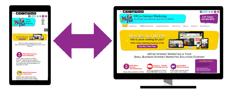
BWYSEBLOG_ResponsiveDesign.pngThe goal of a mobile responsive website design is to ensure the user experience is successful, regardless of what device they may use to view your website.  Although we call it “mobile-responsive” it is extremely important that your website displays and functions well, on all device screen sizes.

Check Your Menus and Navigation

  • Are Your Calls to Action at the Top of the Mobile Display? Make the user’s most common tasks front and center … and easy to find.
  • Are Your Menus Expandable and Easy to Find? Reorganize your menu to be shorter … include the most common functions your users will want to find.
  • Is It Easy to Get Back to the Homepage? For years now, it is common to make the logo a click back to the homepage.  Be sure your website includes this functionality.
  • Reduce/Avoid Full Display Popovers Popup windows that users have to close to be able to view your site are very annoying.  Don’t encourage your users to leave your site by using these popovers.

Check to Ensure Your Website is Easy to Use on a Mobile Device

  • Check that Your Entire Website is Mobile Responsive Make sure that your web designer uses a mobile responsive design, so that all of your pages are responsive.  Don’t just make a few of your pages mobile responsive.

Check that Your Users don’t have to Pinch-to-Zoom

  • Users are not comfortable with scrolling from left to right (horizontally).  When users need to use the pinch-to zoom, they must also scroll left to right.  Not to mention, Google won’t rank sites that scroll horizontally (on mobile) as high in the search results.

Check to Make Sure You Tell Users which Way to View Your Website

  • Users tend to keep the orientation of their phone, the same – either horizontal or vertical.  If your website is easier to use in the landscape orientation, tell users that.  They are more likely to turn their phone 90 degrees, if you suggest they do so.

Check that Your Website isn’t Using new Windows

  • Most mobile users find it difficult to switch between browser windows while using a mobile device.  Avoid creating pages that pop open in a new window.  Too many windows will easily confuse and frustrate your users.
  • Keep your user in a single browser window Avoid ‘full site’ labeling Be clear why you need a user’s location

Following these simple mobile design suggestions will improve your user’s experience when viewing your website on a mobile device.  And … will keep your visitors on your site longer to be able to achieve their desired goals.


Share this post!